Note: this post assumes a basic understanding of Drupal and responsive design.
The Issue
One constantly-changing element within the reponsive design discussion is that of responsive images—that is, creating images in such a way that smaller files are automatically downloaded on smaller screens, saving often-valuable bandwidth on mobile devices. No sense in forcing the user to download gigantic, desktop-sized images on a tablet or phone, right? Then there's the issue of image art direction, by which I mean allowing designers to crop images for specific screen sizes rather than scaling a large image whose detail is unintelligible on small screens.
The Drupal Module Landscape
In Drupal, two modules that are "in core"—officially part of Drupal—in the yet-to-be-released version 8, are Breakpoints and Picture. The Picture module implements the Filament Group's Picturefill JavaScript polyfill, which downloads one of several pre-cropped image sizes and displays it on the page depending on screen or browser width. These two modules integrate, in turn, with Media 2.x, which is Drupal 7's go-to media handling solution.
Breakpoints and Picture are fairly new, though, and have very little documentation, which meant I had to stumble through the darkness of theme-specific responsive breakpoints, Picture module settings, Image (formerly Imagecache) presets, and Media view modes. It's several layers deep, and if you miss one step, you could end up with... nothing.
How You Do It
This assumes you have the following modules installed:
- Media
- File Entity
- Breakpoints
- Picture
Image Styles
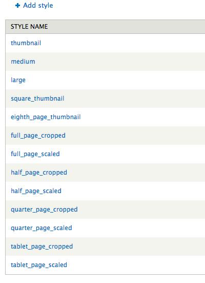
First, let's create some image styles. Go to Admin » Configuration » Media » Image Styles, and add several styles that you will use for your responsive site. On the website I'm currently building, I have a 4-column responsive design that goes up to a max-width of 1160px with 3 20px gutters, which means that each column's max-width is 275px. For this site, I created a "Quarter-page", "Half-Page", "Tablet Page", and "Full Page" sizes. My images can fall into those size categories depending on how many columns they need to span (depending on screen size, of course).
Here are my image styles:
Media 2.0-unstable7 (the latest version of Media 2.x) contains only serveral view modes—"Link" and "Original"—so let's go into code, in a custom module, and quickly add some custom view modes. Don't worry, it's really easy. Here's the code, usinghook_entity_info_alter (assuming a module entitled custom.module):
function custom_entity_info_alter(&$entity_info) {


$entity_info['file']['view modes']['quarter_page'] = array(


'label' => t('Quarter-Page'),


'custom settings' => TRUE


);


$entity_info['file']['view modes']['half_page'] = array(


'label' => t('Half-Page'),


'custom settings' => TRUE


);


$entity_info['file']['view modes']['full_page'] = array(


'label' => t('Full-Page'),


'custom settings' => TRUE


);


}
What this did is create view modes for file entities entitled "quarter_page", "half_page", and "full_page". These view modes can be used in displaying image sizes for various areas of the website. Here's what it might look like:
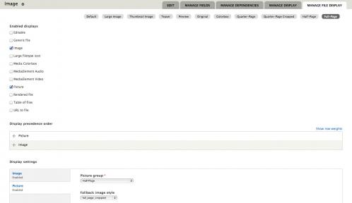
Now that these view modes have been enabled (make sure you've enabled this custom module!), go to Admin » Structure » File Types, select "Manage File Display" next to the Image file type, and set the image presets to the corresponding view modes (e.g. for "Quarter Page" view mode, select "Image" in the series of checkboxes and then select "quarter_page" as the Image preset).
Breakpoints Module Settings
To add Picturefill styles using the Picture module, first create some breakpoints using the Breakpoints module. What I do is create series of breakpoints that correpond to the media query breakpoints in my stylesheet. As per the Breakpoint module's instructions on its project page, you can set up some code-based breakpoints in your live theme's .info file:
breakpoints[mobile] = (min-width: 0px)


breakpoints[narrow] = (min-width: 560px)


breakpoints[wide] = (min-width: 851px)


breakpoints[tv] = only screen and (min-width: 3456px)
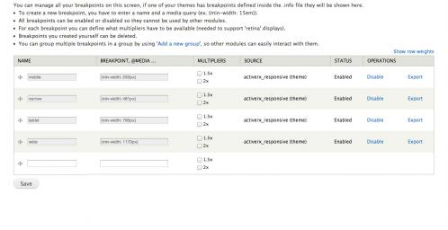
After doing this, clear your Drupal cache and then enable the Breakpoints module. Navigate to the Breakpoints settings page (Admin » Configuration » Media » Breakpoints). Provided you added these first to your .info file and cleared the cache, your breakpoints should show up properly. You can create "breakpoint groups", which can be used for differently-sized images. For example, you could create a "half-page" breakpoint group that only uses your smaller image sizes. There should be a default group with your theme's name if you added code to the .info file.
Here's what it looks like:
Picture Module Settings
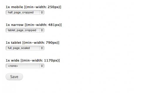
Next, navigate to the Picture module settings page (Admin » Configuration » Media » Picture), and set various Image presets to correspond to your breakpoints. If you've created a breakpoint that works for a roughly haf-size screen, you might want to use your half-size Image preset as the image that gets shown on screens around that size. Note: if you're using min-width to determine your breakpoints, you'll have to specify an image size that's large than your specified min-width so it'll scale down (rather than being too small to begin with).
If you look closely at the picture below, you'll see my image styles from a previous screenshot selected here.
Now, Back to the File Types Area
If you navigate back to the "Manage File Display" page for the image file type, you'll notice that "Picture" is available to be chosen as a display method for each view mode. Here's that screen shot one more time:

As you can see, my various view modes are in use and I'm using both "Image" (the generic image presets) and "Picture" (the Picture module presets with breakpoints). If you select "Picture" first (using the drag and drop icons), the various sizes will display anywhere you use this image. Of course, you would have to choose the desired file view mode on your content-display settings, so if you're wanting responsive images on a node, you need to enter the content type's Display Settings and choose a view mode of the image field that, in turn, had "Picture" selected.